So the holidays are coming up, and I’m starting to get swamped. I have a little free time this week, so I’m going to try to clear a couple of workbench posts out of the backlog. This one is a Studio Bergstrom model, their Terran Cruiser. Not be be confused with any other Terran Cruisers.
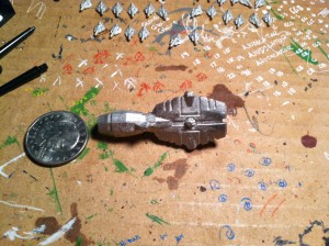
Like the caption says, that’s a top view of the Terran Cruiser. The coin on the left is a Susan B. Anthony dollar, and the models up top are Bergstrom “Cobra Fat Boy” fighters. (Is that what they call a teaser?)
As usual, click on the picture to get a full size version.
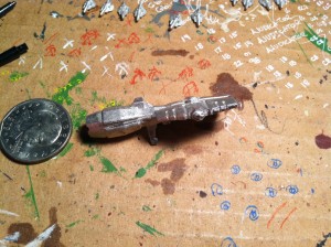
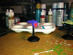
Normally, I don’t bother with “front view/side view” comparisons, but for this model, it’s worth doing. Note that the forward half of the ship (that farthest away from the coin) is flat and wide. This is not a normal sight in spaceship miniatures. It reduces the ship’s swoosh-ability, and makes it a trick to paint.
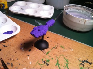
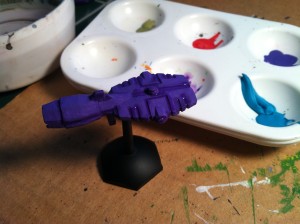
As usual, we’ve got a base coat. The primer is a cheap white primer from my local hobby store, from a company called “Board to Pieces.” It’s not as good as the Citadel or Army Painter ones, but it’s still a decent minis primer. The base coat is the Craft Smart Purple Acrylic Paint, and it dries a shade darker than the paint in the bottle.
Long-time readers have seen this technique before; it’s the same one I used on the ORCDeF cruiser. (Click on the link for the details.)
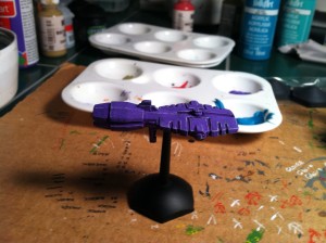
The wash is also a Craft Smart Arcylic, because I bought the triad. (Not the triad in the traditional color-theory sense, but triad in the base-shadow-highlight sense.) The wash color is Violet (yeah, Violet is different than Purple), and the highlight (which we’ll see later) is Lavender.
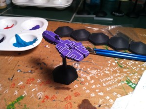
Normally, I’d do an edge highlight, and let the model work for me. In this case, though, the light highlight really didn’t do the trick, primarily because the base coat ended up so dark. It probably would’ve worked a little better if the base and the wash were not so similar.
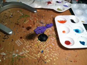
Because of that, I embraced the anime-ness of the model and transformed the highlights into inverse blacklining. It’s not really the approach I was looking for when I started, obviously.
My new problem is that the ship is now unbalanced forward. I’m pretty sure it would’ve been unbalanced forward with any paint scheme — it seems to be the flaw of this model. To fix this, I broke out the Citadel Flash Gitz Yellow, and labeled this ship C81. Because I’ve got a big yellow splash on the back, it draws the eye a bit; and the smaller yellow blobs up front create a visual triangle that unifies the paint job.
I’m not sure I’m going to pick up any more of these. These are excellent models, like everything else I’ve gotten from Studio Bergstrom. It’s that I’m into swoosh-able, while this model is more reminiscent of that “deliberately awkward bad guy” style that you might see in certain anime. (I’m thinking Sanadon from Shingu.)

